

My mission was to redesign the Google docs iPad app to make it more efficient and functional.
Project type:
Independent redesign
Timeline:
3 weeks
Deliverables:
Research, Processes, Copy, High Fidelity designs.
Collaboration:
Worked with Google Engineers and Docs for iPad regulars

The Short Story:
Google Docs iPad app has an inefficient UI and a fraction of the functionality when compared to the desktop experience.
After secondary research, interviews, prototyping, and iterating, I redesigned the UX focusing on solving this efficiency and lack of functionality problem in a way that is user-friendly, enabling, and intuitive.
In an impact survey, 86% of the 21 avid users of the app regarded my redesign as more efficient, and 90% said that it was more functional.
Project approach:

Digging in:
Secondary Research: Reddit posts on Google software for iPads, interviews with users, and polls with those familiar with its’ functionality that I accumulated into an affinity map.
Primary research: When polling 96 people on Instagram comprised of students and young professionals, and Google software engineers about their experience in app , 56% said that they disliked the experience, and most did not continue to use it. This trend persisted when I isolated the group further into 21 regular users of the iPad version where again 57% disliked the experience quite a bit.
I mapped these patterns holistically on a centralized document and synthesized the design opportunity.
Here is a link to that doc, supporting visuals are below.
Where do we go from here?
I sought to approach the design of these features with Google’s material design guidelines, incorporate functionality from Google Docs desktop and other competitors, simplify and increase accessibility on current functionality, and take more advantage of the touch capability of the iPad.
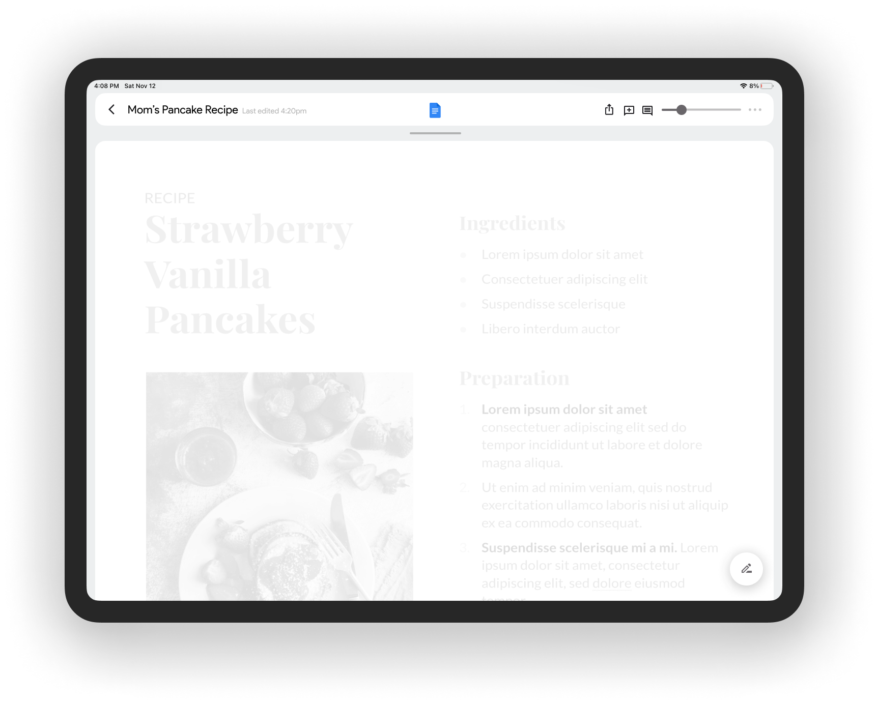
Current Google docs for iPad interface
Wireframing:
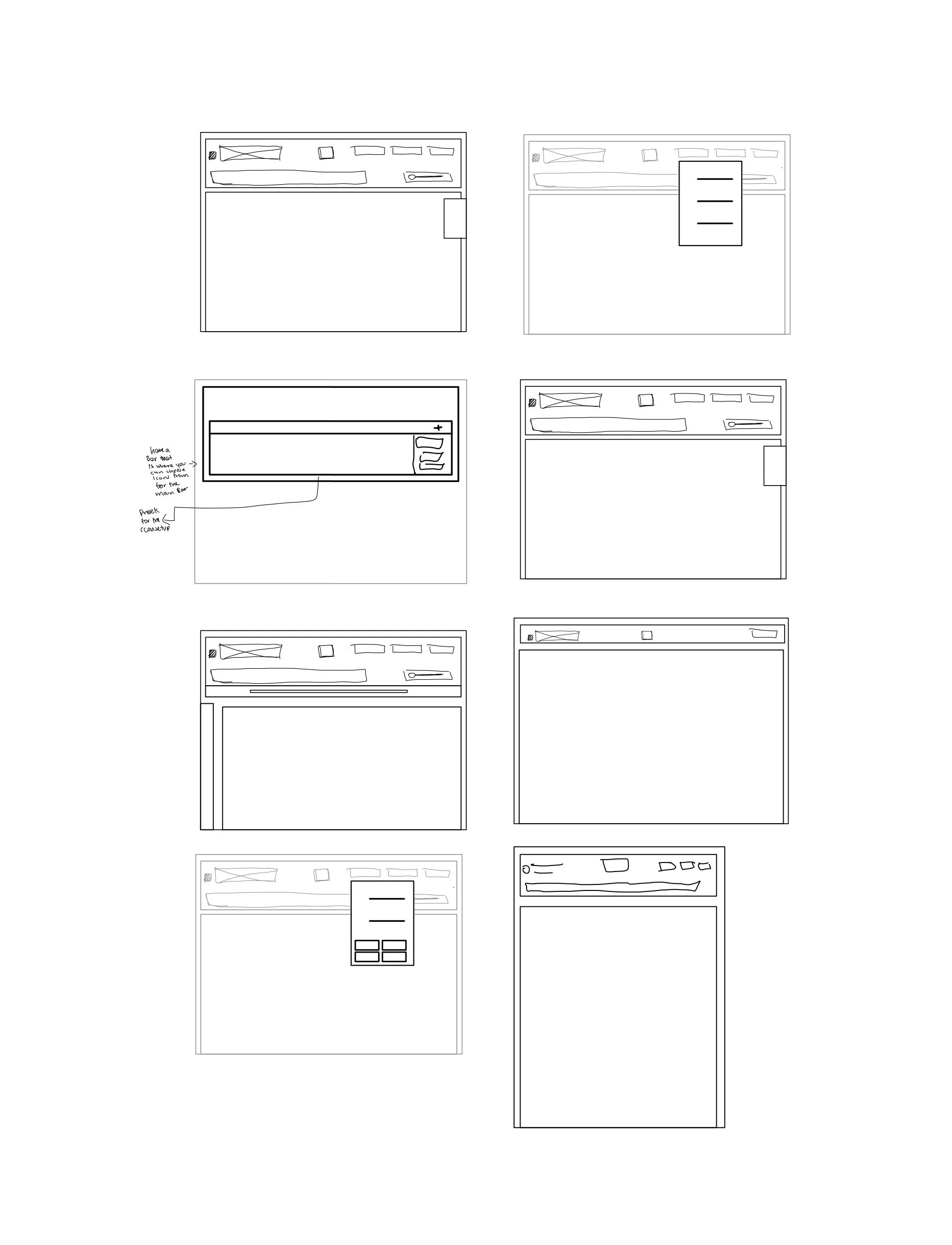
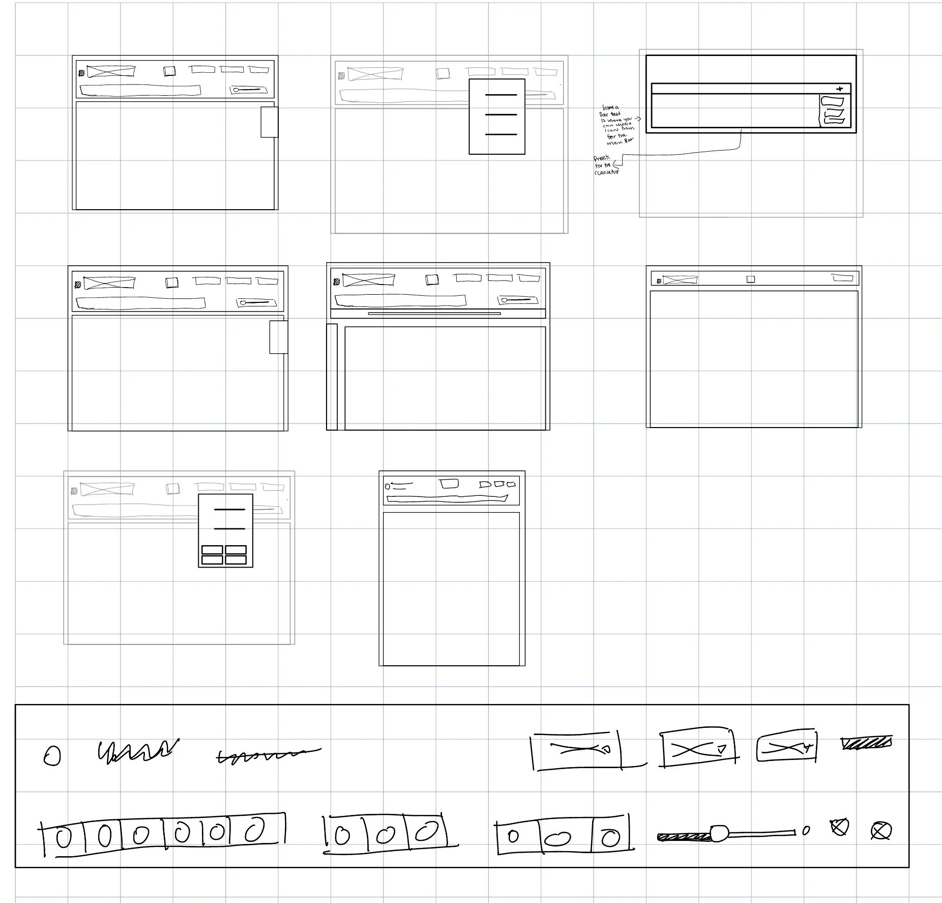
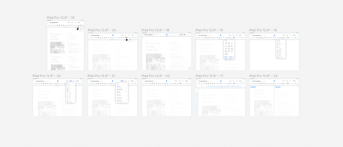
First High-Fi Design
Feedback Round 1:
Group: 21 frequent Google docs for iPad users
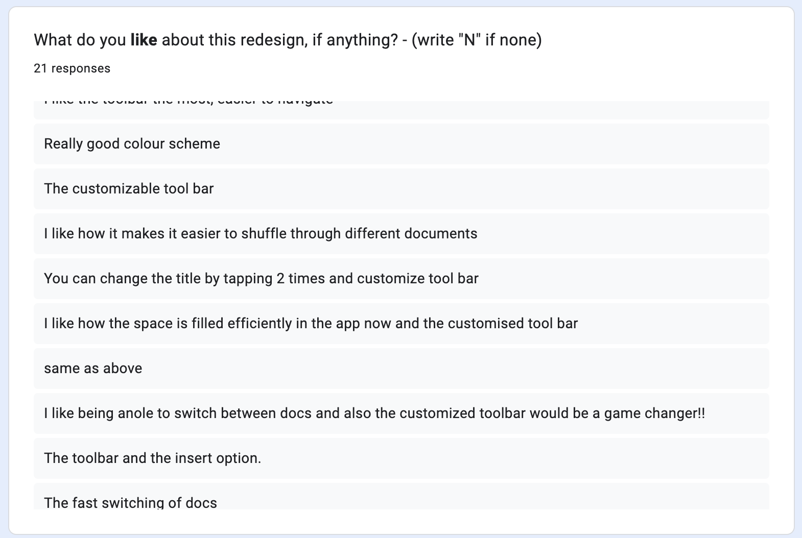
In my survey, I received a lot of positive feedback. 85% of users liked it, but there was still criticism that I wanted to explore and potentially incorporate.
Some users said:
The dropdown buttons need to communicate that they display a menu and not perform a single action.
Certain icons needed to be larger.
Certain icons do not accurately represent their action.
The purpose of the page scrolling feature is not obvious.
Incorporating Feedback:
After this feedback I decided to make these changes:
Differentiated between buttons and dropdowns, and added a blue indicator
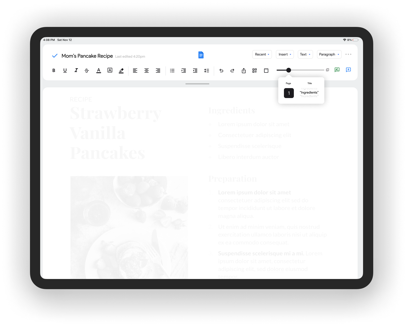
Labled the page scrolling functionality so that it is clear that you are able to move to a page, or a specific title, with minimal finger movement.
I also chose to separate the docs switching functionality into two separate features.
I chose to add a “recents” button in the top right navigation and make the gesture-switching functionality a tab above the document to make it clearer.
Redesign 1 🤩
Feedback round 2:
Group: 21 frequent Google docs for iPad users
After incorporating the feedback of the users, I conducted another survey to evaluate the reception of these features, asking questions about what features they wanted to see and how much they would use each feature, in an effort to quantify their desire for these features.
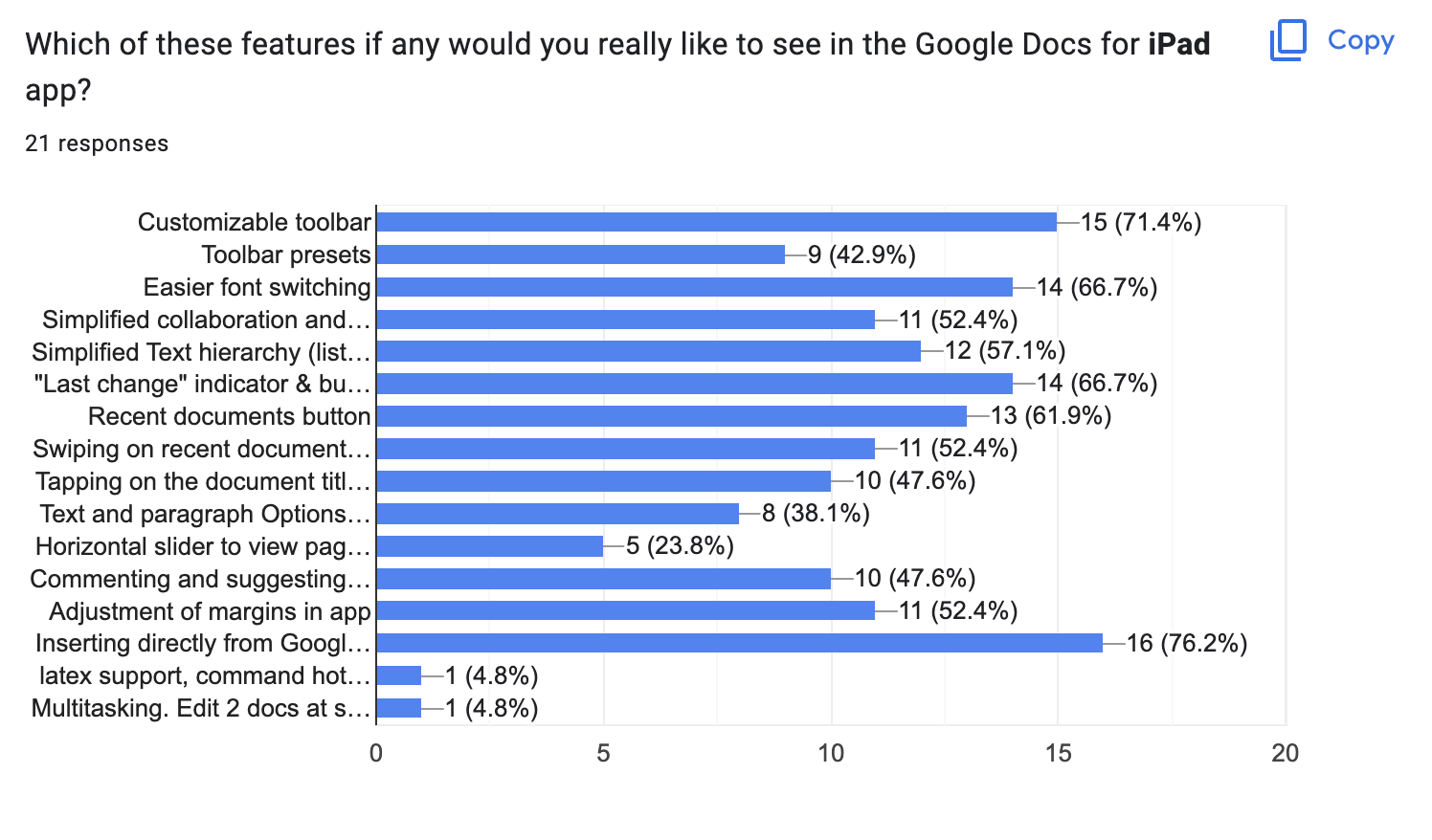
The features most desired to be in the real app were:
71% liked the Customizable toolbar
67% liked the Easier font switching
67% liked “last change” indicator and document history button
76% Liked inserting from Google Drive
Final designs:
Here is a formal list of features introduced in this redesign, and the Figma file.
More power to your fingertips.
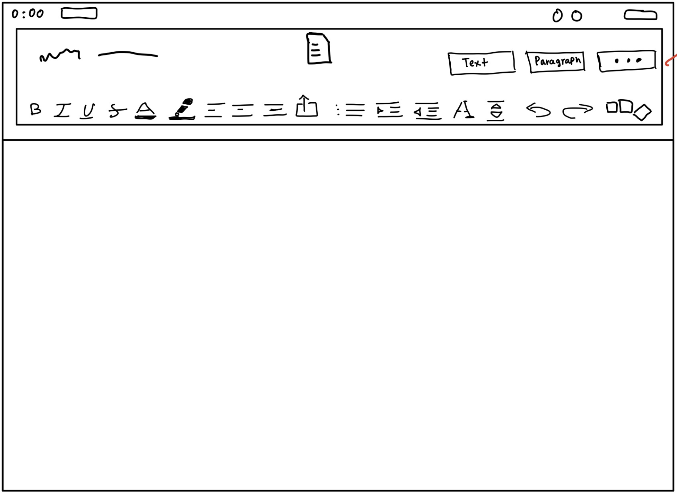
The biggest change in this redesign is the entirely new toolbar.
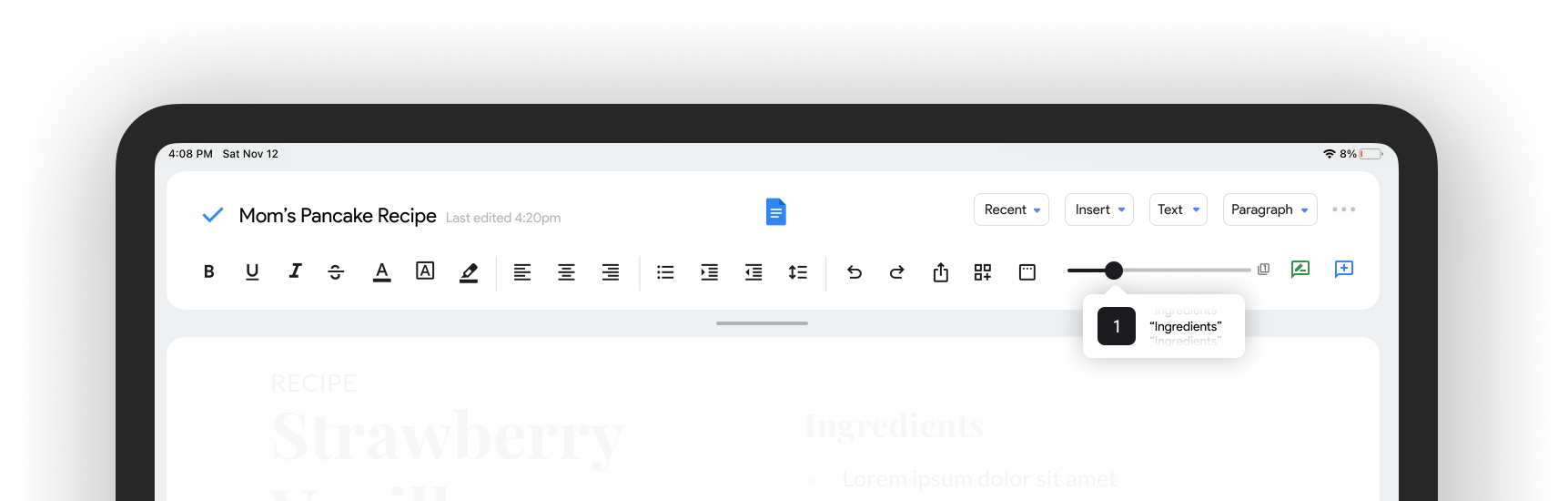
The scrolling page viewer makes scrolling between pages more convenient as your finger is moving far less per page, and you can jump to a specific title or page in the document instantly
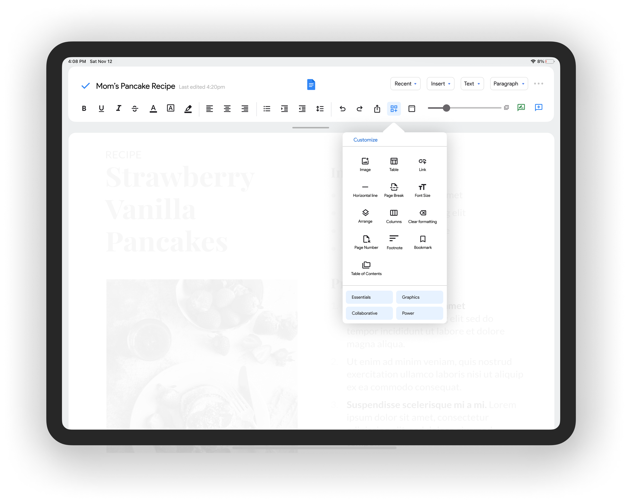
The Ability to Customize
Google Docs has many uses, it can be used to produce resumes, flyers, papers, diagrams, recipes and so much more.
I designed a customizable toolbar, as each of these use cases would greatly benefit from the ability to change the quick-access icons.
Further, there are presets accessible at the bottom of the dropdown, like “essentials” making revisiting specific settings instantly.
More than a Marginal Difference
The current version of Google docs on iPad does not let you adjust your document margins.
Using the web version as a reference I designed a margins feature that integrates into the design language I created alongside the material design guidelines.
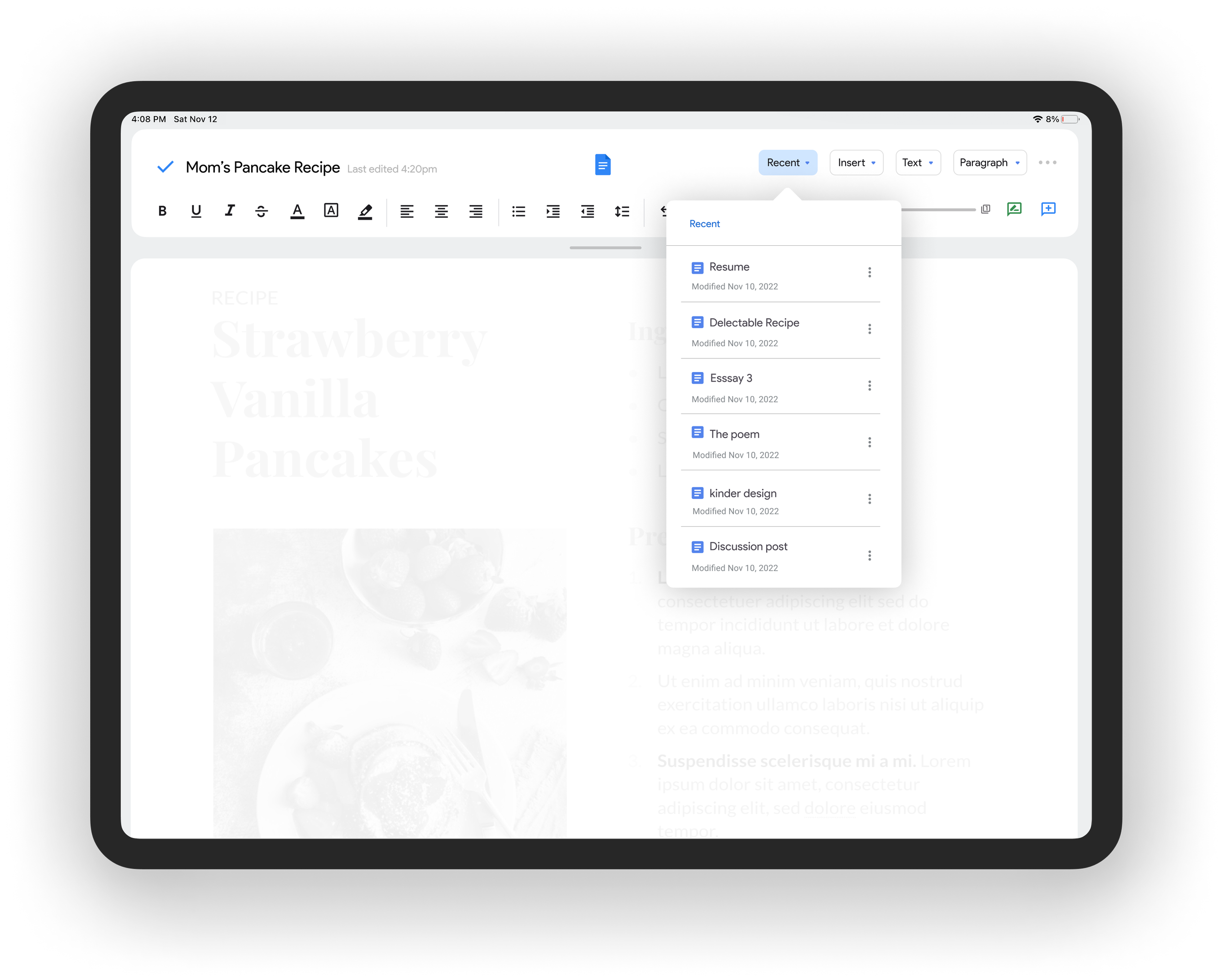
Oh, There’s Multitasking Now?
I designed a dropdown menu taking the document details from the Google Docs home screen and condensed them into a “Recent” documents menu.
I wanted to reduce the number of presses needed to switch documents to make referencing other documents much more efficient.
I also designed a gesture bar tab that will allow you to switch between docs, making sure the order only changes when editing to not have the changing be a loop.
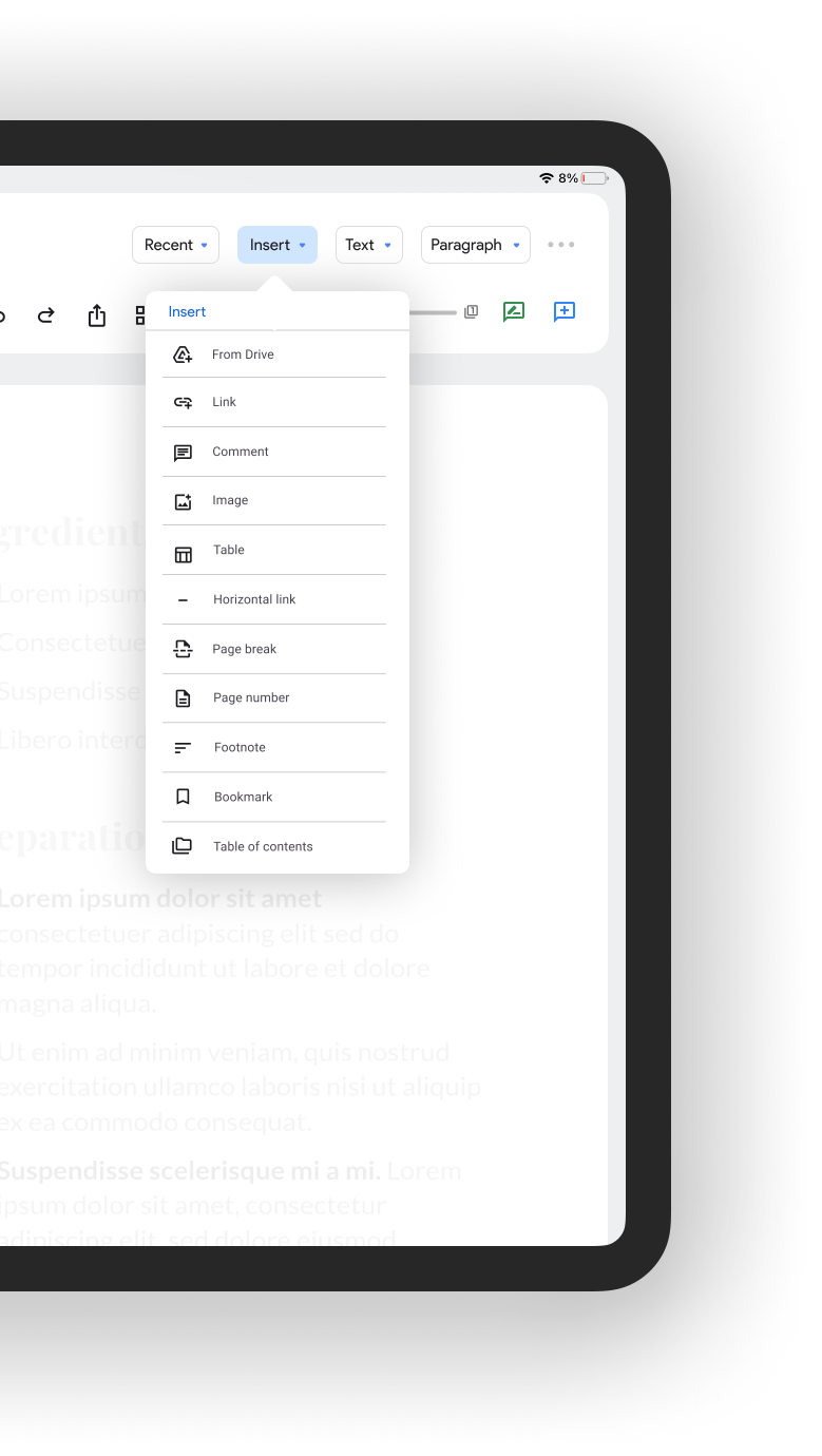
Making Google Docs and Drive play nice
I wanted to ingrate inserting from drive into the “Insert” menu, as it makes it so much easier to refer to documents that you likely store on Google drive.
This seemed a small change to me but this was by far the most desired, as 77% of the survey group wanted to see it make it to the app— the highest percentage of any feature.
Sharing is Caring
The sharing options on the current app are behind 3 - 5 touches, and labeled in a confusing manner. Exporting to PDF is behind an option called “send a copy” but there is a direct export button for Word documents (docx).
I brought these key export and collaboration settings into one dropdown button, making all sharing and collaboration options 2 touches instead.
Viewing things differently
The existing view mode of the app doesn’t offer a convenient way to share the document, nor a way to scroll the doc accurately and efficiently.
My solution incorporated this with a share sheet and the scrolling page viewer makes scrolling between pages more convenient while losing no space to view the doc.
Impact:
I did a final survey of the total testing group to answer - did I achieve the goal of making the app more efficient and functional?
86% of the 97 participant test group regarded my redesign as more efficient, and 90% said that it was more functional.
Although I think we achieved the goal!

Retrospective
After doing this redesign I realized that I really enjoy the UI challenges that have the opportunity to affect my day-to-day, as well as working with others to understand how to improve their experience.
The iteration process is so energizing to me. Having conversations with users that provide that data to help design my solution is something that makes me really happy.
It was really fulfilling to look at the design and its reception afterwards, and realizing not only do I love doing this work but it has the power to make someone else’s life easier.
If I had more time and resources I would dive much deeper in the the research process, increase the size of the test group, speak to more engineers, use the information to inform my redesign work and run more cycles of the iteration process until my testing group was in love with the features and excited to seem them built.
Made with love,
Shaurya Narang