
My mission was to bring a beautiful waterfront community into the 21st century.
Project type
Internship
Timeline:
3 months
Deliverables:
Branding, Brand guide. High Fidelity flows, Prototypes, Processes, High fidelity designs, Copy, and photography.
Collaboration:
My collaboration was working with the head of management and the onsite property managers.
TLDR:
New management has taken over the above commercial Bay Area waterfront property, and they seek to modernize their property management solutions.
I collaborated with the management team to conduct secondary and primary research and we identified that the design goal was to build a web platform that supports, connects, and represents the tenants of a beautiful waterfront community, all on one website.
I focused on high-fidelity designs for a tenant payment, support ticket, and newsletter functionality, alongside a visual identity, and created the first versions of the website using the Squarespace platform.
These functionalities focused on centralizing all communication and maintenance and in an exit survey I found that there was 93% adoption of the core functionalities— payment and support tickets, and 71% adoption of all functionalities including — payment, support ticket, and newsletter, functionality, alongside a visual identity.
My Design Challenges were to make sure that all the tenants are kept in the loop with a monthly newsletter, create a payment functionality that is effortless and secure, create a messaging platform that allows for concerns to be addressed swiftly and satisfyingly, To Brand the tight-knit community authentically and elegantly
There were some internal research documents I would have preferred to reference in this case study but was not permitted to publicize as they were sensitive. Please email me at shaurya@berkeley.edu for more depth on this case study.
My Research Process:
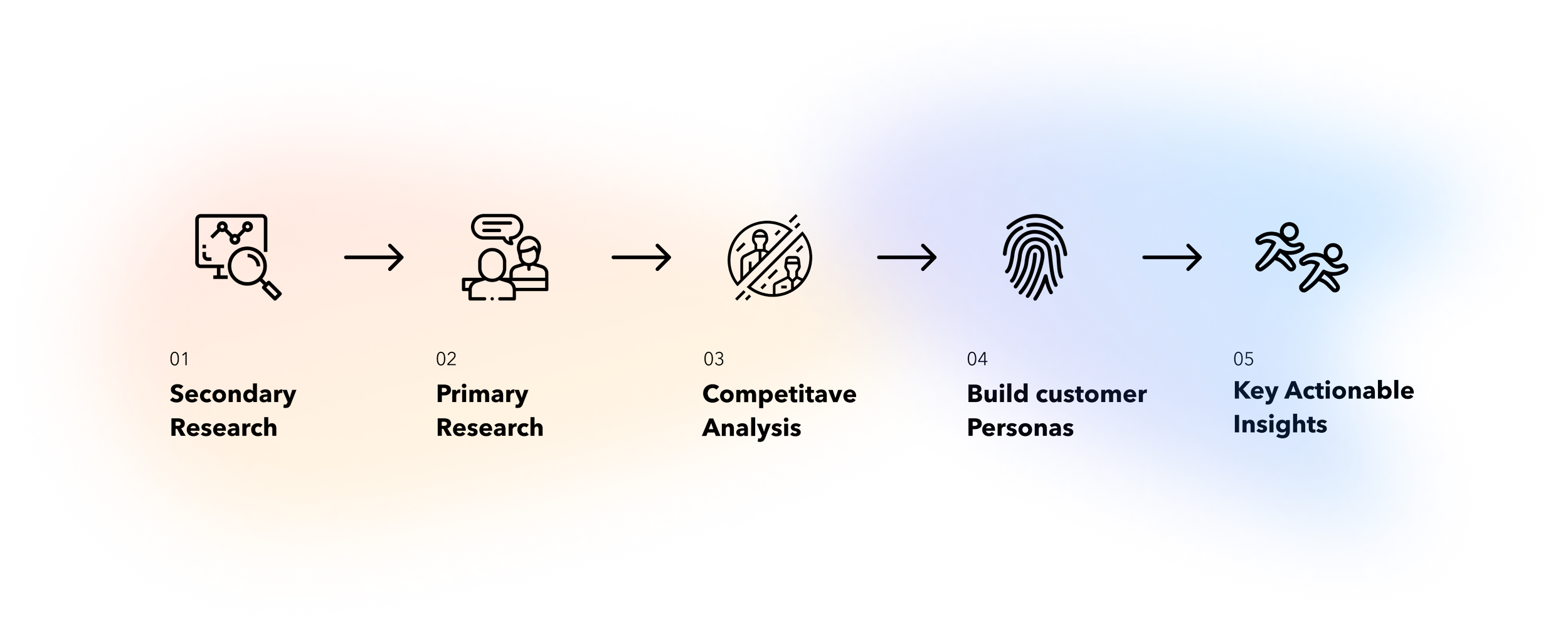
Diving into research:
What are the tenant and management pain points and objectives?
Secondary research:
Immediately, I saw that this commercial real estate project was not like many others. The residents of these waterfront homes loved their serene and picturesque lifestyle, just as much the square-footage of their home. This unique ethos would define how my approach to designing their brand.
Primary research:
In my interviews with the tenants, they expressed a dislike of complexity. The tenants were mostly retired professionals who wanted to be able to communicate, pay, and be kept in the loop in a simple way with minimal stress of adapting to a new solution.
The new management wanted to make sure that things were efficient, and rework the current archaic soltiuons used to run the property. The management wanted to satisfy the new tenants with a better solution as a means of good faith.
What are the current solutions?
I needed to understand the state of the processes I will be replacing with a digital solution
Any concerns were delivered in person to onsite managers. This was dependent on hours and made managers have to individually relay messages.
Communication of updates and maintenance between management and tenants was done inconsistently by email or by word of mouth.
The project’s brand was highly old-fashioned as it was made years ago. It didn't represent the new ownership’s interests, values, or vision.
Payment tenants was managed physically with checks or cash and cataloged manually in an excel sheet.
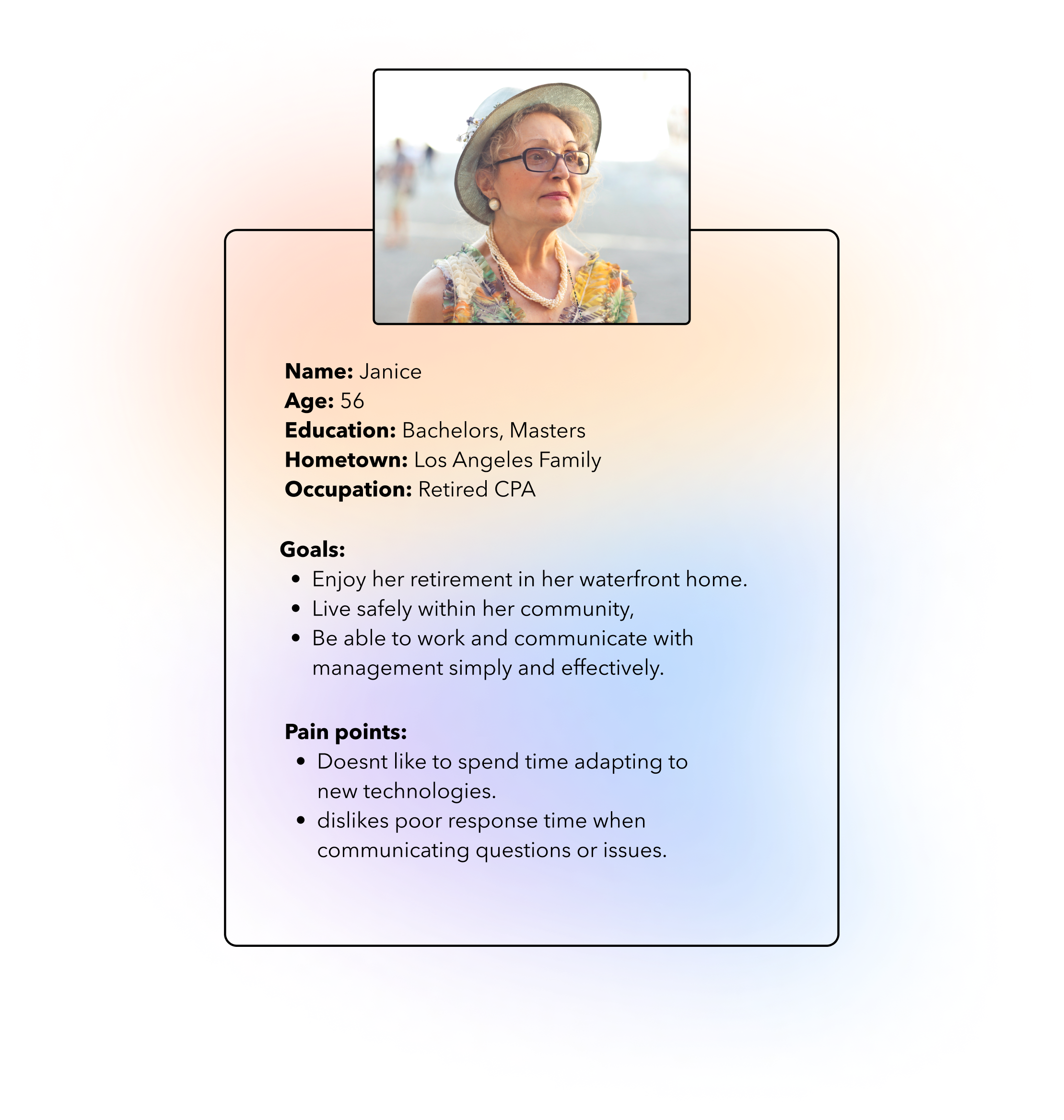
Who am I designing for?
The Persona:
I sought to undertstand the kind of tenant I’ll be building soltutions for through the internship. When I spoke to management they provided me with initial information in regarding the body of the companies customer, but I conducted a Google Forms survey and consequent interviews of my own to find patterns that I synthesized into this persona:
Key Actionable Insights:
Through my research of the current solutions, the body of tenants/customers, and the objectives of the organization— I developed the core principles I will use to guide my design process:
01
These antiquated solutions had to be reworked.
Many of these solutions persisted only because as tenants were already familiar. The old management was not as concerned with efficiency as the new management is.
02
The design needs to maximize functionality and minimize complexity.
The new solutions implemented need to be a happy middle ground between the most efficient and the most familiar. The new tenant’s ability to adapt to solutions was relatively low because of their age.
03
The designs need to be efficient and friendly for users.
The new management wanted to develop a relationship with the tenants and developing better solutions to how things were run was a large point in their plan.
The Problem Statement:
My mission was to design a web platform with a tenant newsletter, rent and fee payment, and support tickets management system— all with a visual identity representing the values of the community and management.
The BHMC has recently acquired a new commercial property in Alameda California.
They want to develop a product supporting efficient payment for all commercial and residential tenants, secure mass communication between management and tenants, and a professional brand representing the communities values to utilize for future development efforts.
The tenants welcome a new solution, but want it to be simple, made for a older demographic, simple and highly user friendly.
After I developed clarity for what I was solving for, I was excited to take on this challenge.
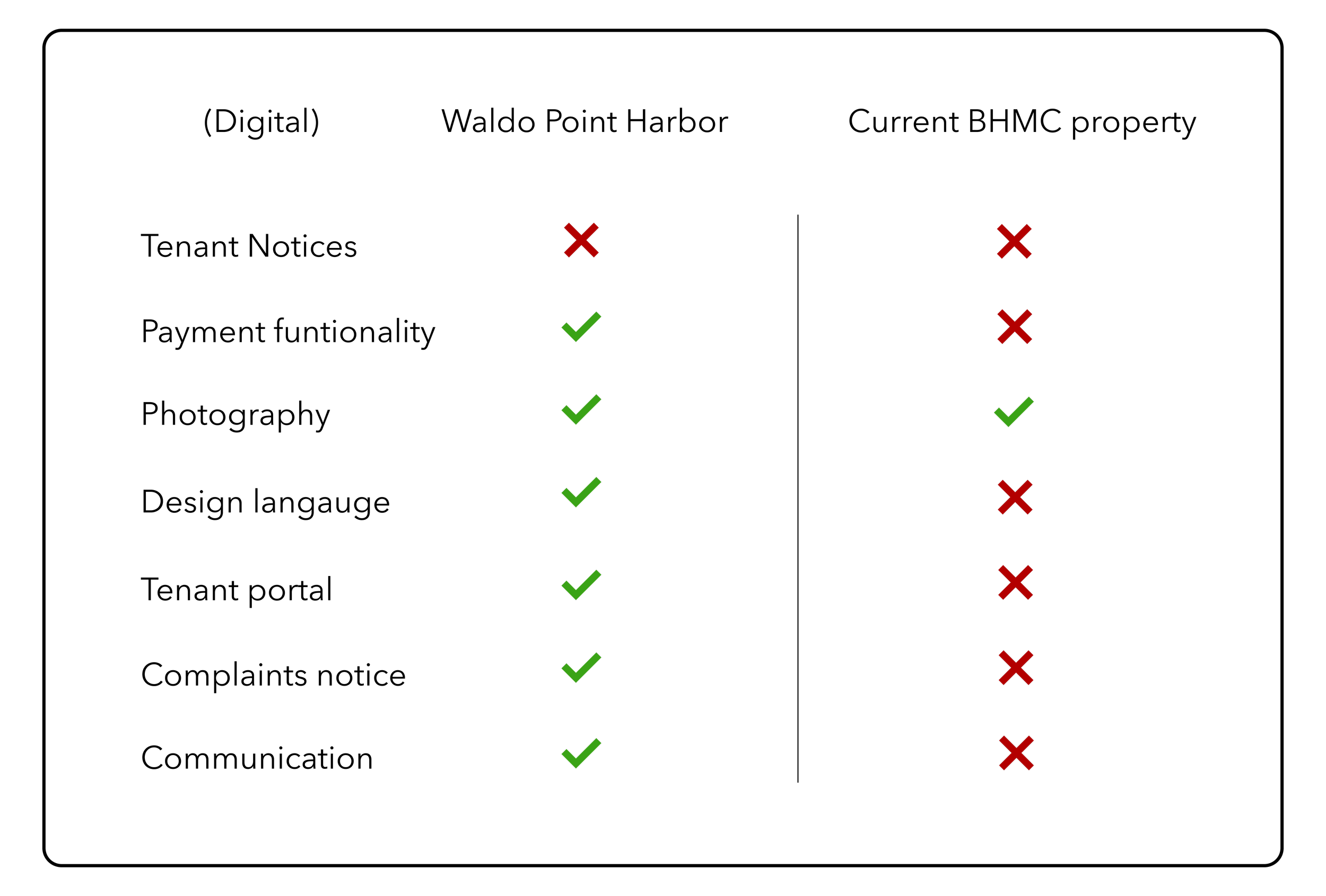
The competitive analysis:
How are other marina properties handling this?
The BHMC has recently acquired a new commercial property in Alameda California, but it wasn’t the only waterfront property in the area. I interviewed the owners, managers, and tenants of other marinas, looking at how they solved for each functionality in my scope.
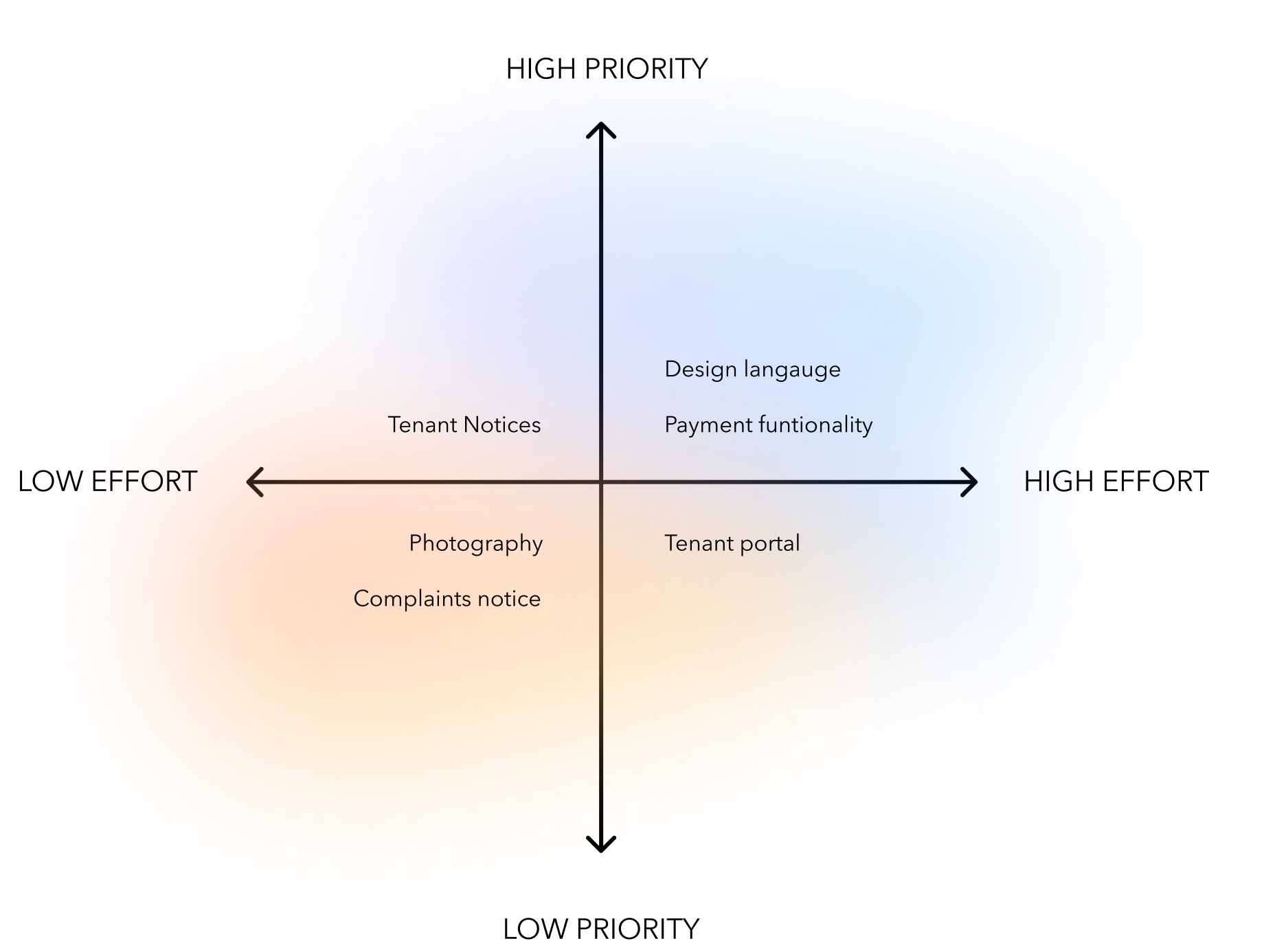
Now to prioritize features
Plotting a list of the possible features onto a graph helped narrow down what was absolutely crucial for delivering the mvp and would could be built upon further down the road.
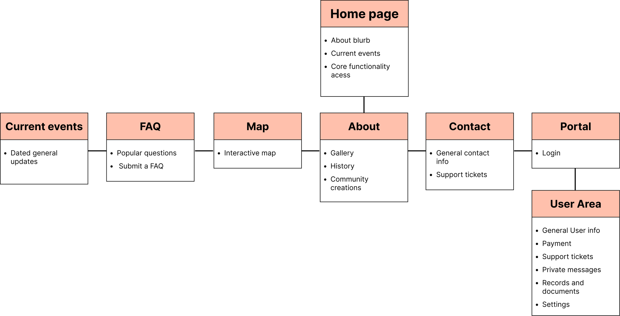
Sitemap:
After I structured the features in the fashion that I though was best, I laid them out in a sitemap so that I could get the primary stakeholders approval in our meetings going over the project. Since all the features that we set out to design were included, and kept the structure of the website uncomplicated the structure of the website was approved for me to work into wireframes.
The Philosophy Behind the Brand
When I was looking at the sort of websites that the tenants visit, they tended to have the easiest time using those that had a simplistic layout, few colors, and serif text. I used this information and the companies vision for the branding to construct a visual identity.
The visual decision on this website allow for the functionality to be obvious and for the images and photography to take the stage as again- this is built for an elder audience.

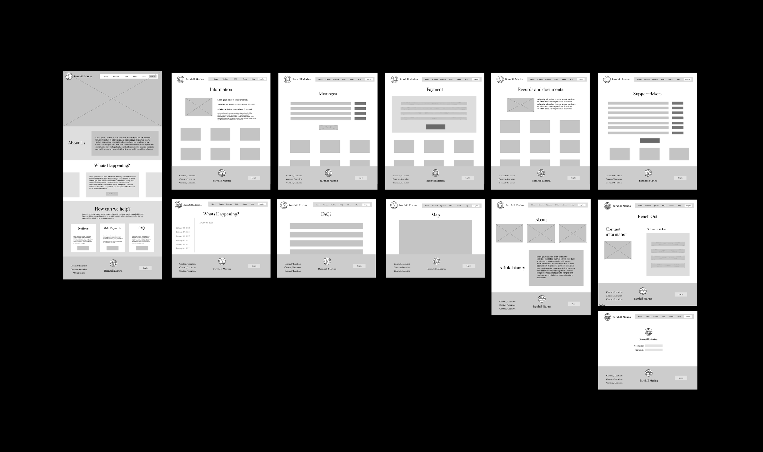
Wireframes:
It was important for me to develop wireframes so that I could further visualize the future experience of the website and be able to communicate with key stakeholders.
Building on the approved site structure and features I laid out the vision that I had and presented it to the property managers and owner in a followup stakeholder meeting. I received feedback on wireframe regarding the layout of the home page and support tickets layout. After incorporating those changes here is the final wireframe:
My takeaways from this project:
Research, test, repeat, as there is no perfect answer.
Before going into this project I had noticed a bad habit of mine where I would spend far too much time doing research for a project. I think that by being strategic and thought out about your decisions and even data-gathering methods, there is a certain point where this research reaches marginal returns. Through this internship, I was able to habituate putting a stop to my research phase and begin the process of making something and tweaking it until it does its job. This was extremely rewarding and unexpectedly pleasant. I was able to learn so much more as I would be asking my manager for feedback frequently regarding my design decisions often instead of racking my brain to find the perfect answer.
My strengths as a designer
At the end of the internship, I received detailed feedback about my strengths as a designer – something I had never received before.
I learned that I excel at driving projects as my sense of initiative shows, I’m very good at understanding the necessary contextual information needed to build a better product, and I also learned that my biggest area for growth is organization. Now in future projects, I make it a point to document as many things as possible as that documentation is key for communicating my decisions.
I enjoyed working in a startup-style environment as there is it seems to be a more collaborative space structured for those who like to move fast and take immediate ownership of their growth and outcomes.
Thank you for reading.
Made with love,
Shaurya Narang